5 Wedding Stationery Tips
What makes a good wedding invitation suite. The term “Stationery” in regard to your wedding day is about much more than just your invitation suite. It references to all paper-good as it pertains to your wedding such as save the dates, invitation suites, menus, welcome signs, seating charts, etc. However for the sake of this of this discussion we are honing in on wedding invitations.
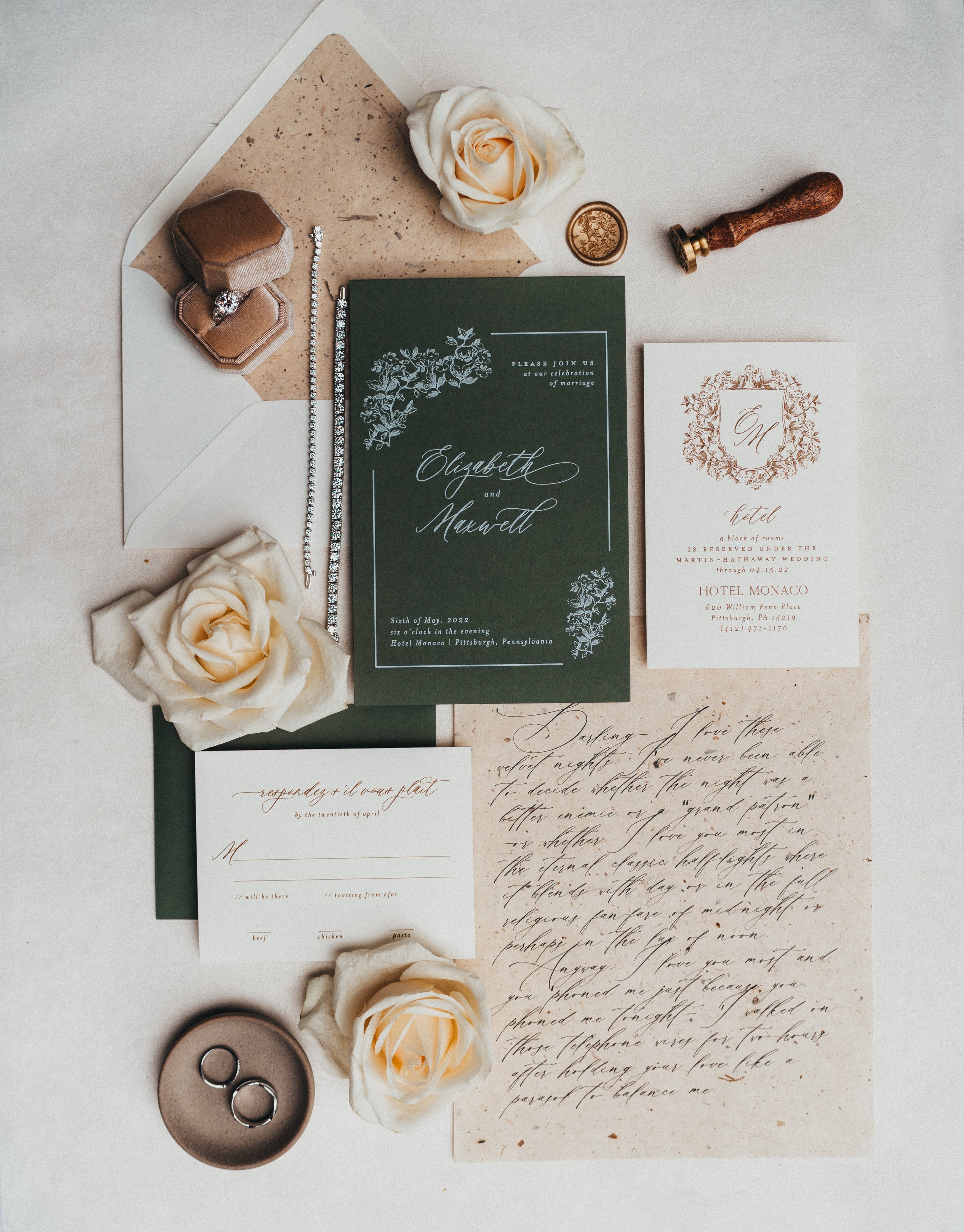
1. Wedding Branding - We believe your wedding day and elements leading up to the day should be cohesive. When we talk about design with our clients we discuss the big picture. We talk about the overall aesthetic and how they want the day to feel and what they want their guest experience to be. Once we have that conversation, then we go behind the scenes to create their wedding design portfolio. In there, we cover the entire day starting with foundational pieces that lead us to our first category: Stationery. Because let’s face it, it really is the first piece of the wedding that your guests get to experience.
2. Story Telling Touches - If you know anything about Lorenda Howell Events, you know that we specialize in creating an experience for our clients by telling their love story through detailed planning and design. We help tell your love story by reflecting the love shared between you and your significant other and the life you lead together through the wedding experience. An easy way to do this is by adding, personal touches such as family traditions, pets, sentimental details that speak to your relationship and have gotten you to this journey of marriage.
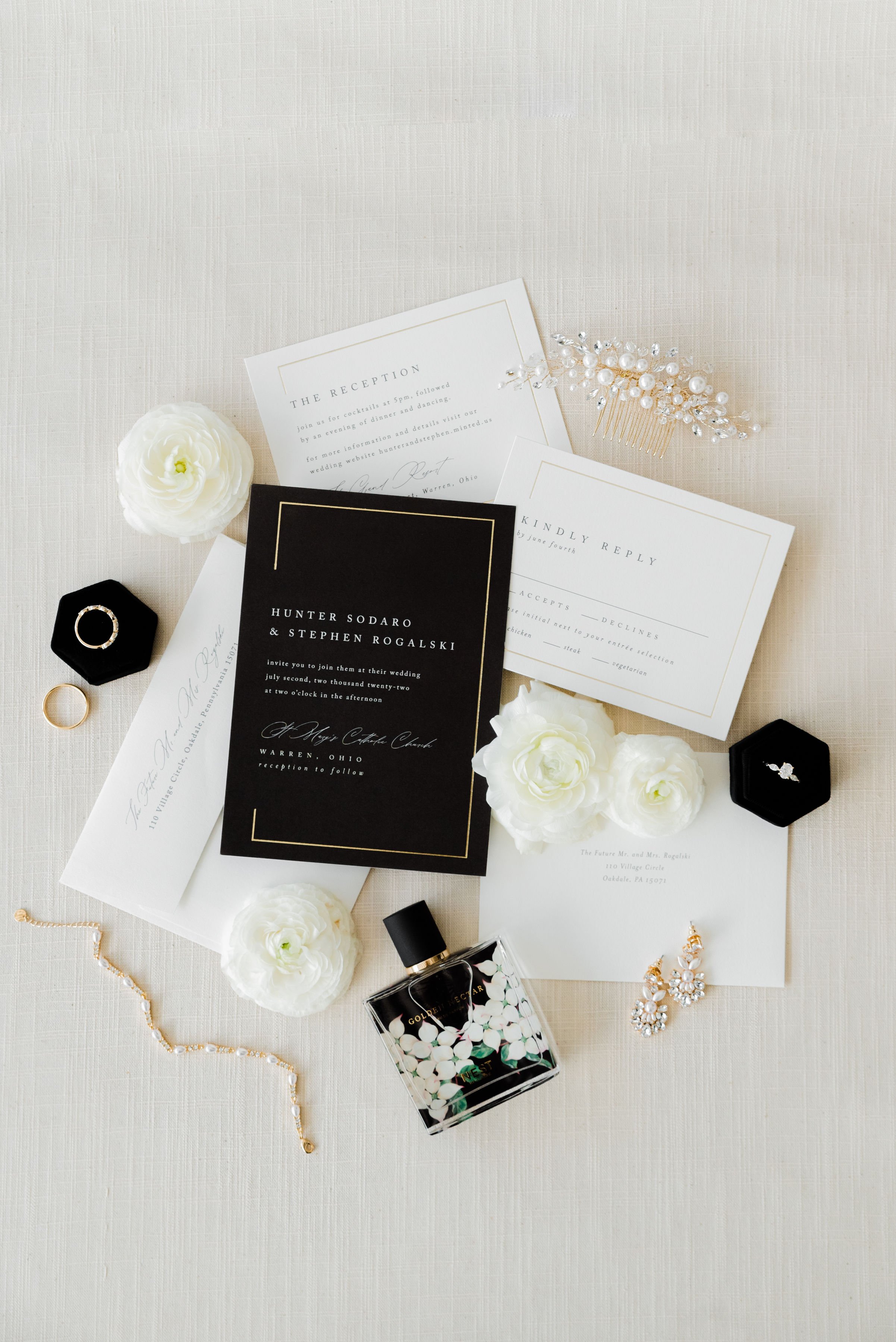
3. Color Palette + Fonts - Timeless, Elegant and Luxury is our style. So what 3 words come to mind when you think of your wedding brand. That is what will help you choose the best colors and fonts for your stationery. A couple wanting a fun, vibrant and romantic wedding isn’t going for white and black with gold accents or a serif or sans font. That color palette and those fonts screams timeless, clean, elegant, possibly chic depending on the color balance. The point is don’t pick colors based upon whats trending or the season and don’t chose font based upon what is familiar or what a friend used, pick something that resonates with you and your wedding brand as it will move the needle forward in telling your love story.
4. Texture, Shape + Size - Love this section of design. This is where the fun really takes place. We get to play with different materials and figure out pairings. We get to see what works with patterns vs solids, grandiose vs petite, geometric vs organic. When our clients work with stationery designers, sometimes we have them mail out color swatches and different types of paper to compare size, weight, texture and color preference. This is a great way to add dimension to a very clean and simple invitation suite.
5. Wording - If you’ve laid the foundation with the other tips we’ve provided, now it’s time to finalize your invitation suite with the wording. The must have information on any invitation suite will be: who’s hosting, the request of attendance, your names, the date and time, location, reception information and dress code. Of course you will need a separate card for rsvp, even if it’s going to be through the wedding website, that should not be on the main invitation, it should always be a separate insert. Remember the words you choose should tie back and resonate with your wedding brand.
These are great tips to elevate your wedding invitation suite and your other stationery items. We always suggest hiring a professional stationery, if it is within your financial comfort zone. However, Minted is our favorite alternative option of online stationery companies to choose from.
We trust you find these tips helpful. Feel reach to email us with any cool ideas for your wedding stationery.


